The roar of engines, the smell of burning rubber, and the kaleidoscope of colours streaking across the track – race car graphics are an integral part of the thrilling spectacle that is motorsports. In this journey through time, we delve into the fascinating history of race car graphics, exploring how they evolved from mere identification markings to dynamic expressions of speed, innovation, and sponsorship.
Early Days: Functional Identity
In the early days of motorsports, race cars were identified by simple numbers or national flags. These functional markings served the primary purpose of distinguishing one car from another on the track. However, as the popularity of racing grew, so did the need for more visible and recognisable identification.
1960s-1970s: The Birth of Sponsorship Graphics
The 1960s marked a significant shift in race car graphics with the introduction of sponsorship. Companies began to realise the potential of placing their logos on race cars to reach a wider audience. This era saw the birth of iconic liveries, with brand names adorning the sleek exteriors of race cars. The Gulf Oil-sponsored Ford GT40 and Martini Racing's distinctive stripes became legendary symbols of speed and style.
1980s-1990s: Artistic Flourish and Technological Advancements
As technology advanced, so did the intricacy of race car graphics. The 1980s and 1990s witnessed a surge in artistic designs, with teams incorporating complex patterns, vibrant colours, and even team mascots into their liveries. The increased use of computer-aided design (CAD) allowed for precise and intricate graphics, enabling teams to create visually stunning masterpieces.
2000s-Present: Digital Innovation and Brand Integration
In the digital age, race car graphics underwent a revolution. Advanced printing techniques and wrap technology allowed for seamless integration of intricate designs, gradients, and high-resolution images. Teams and sponsors could now achieve unparalleled visual impact, turning race cars into dynamic canvases that showcased not only speed but also intricate storytelling and brand narratives.
Iconic Liveries and Branding Stories
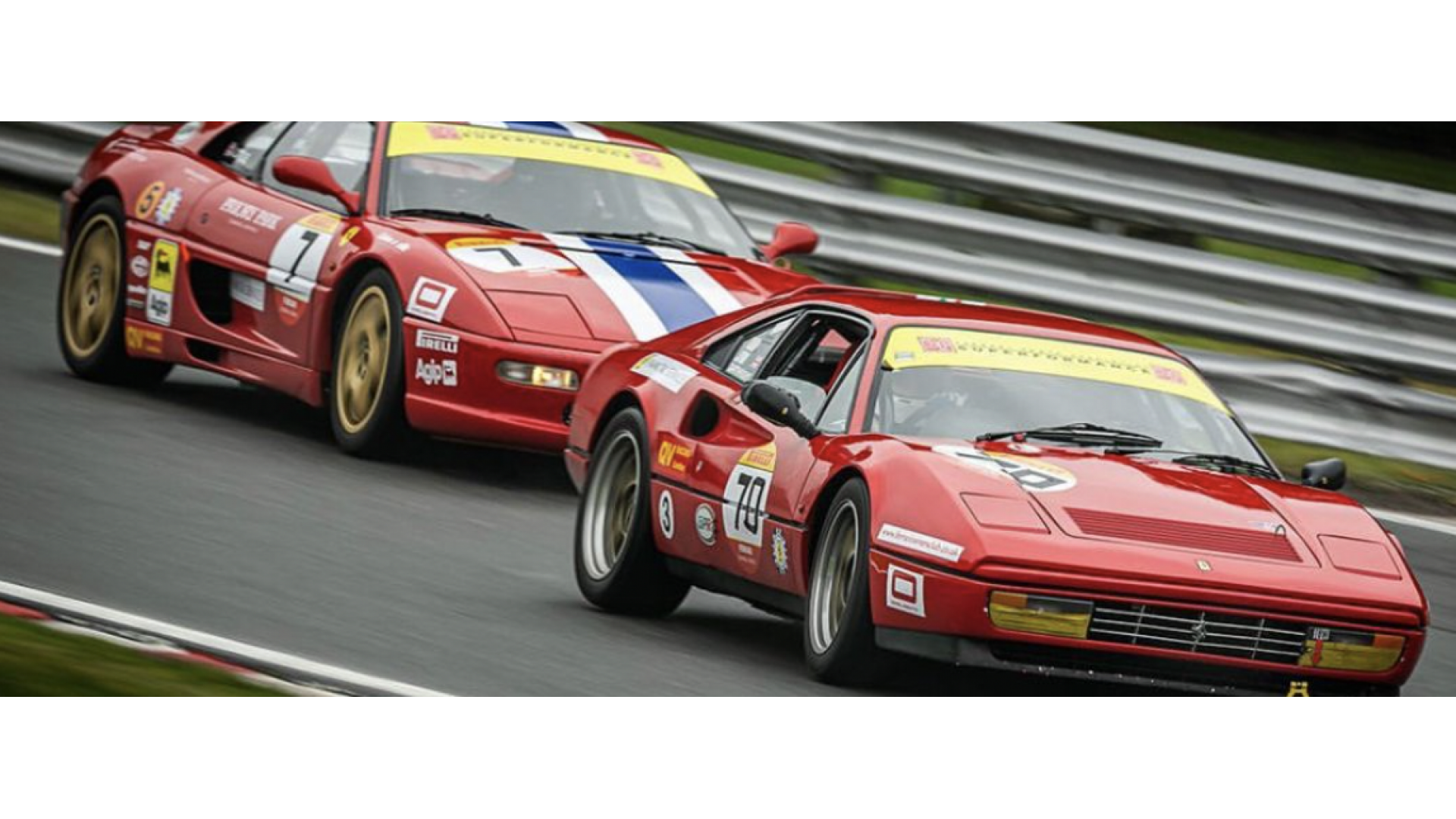
Throughout history, certain race car liveries have become iconic symbols, forever etched in the memories of motorsports enthusiasts. The striking red of Ferrari, the bold black and gold of John Player Special Lotus, or the distinctive blue and orange of Gulf Oil – these liveries transcend the racetrack, becoming cultural symbols associated with speed, competition, and innovation.
Future Trends: Sustainable Styling and Technological Integration
Looking ahead, the future of race car graphics holds exciting possibilities. With an increased focus on sustainability, we may see eco-friendly materials and designs that reflect a commitment to environmental responsibility. Additionally, advancements in augmented reality (AR) and digital displays may open new avenues for real-time, customisable graphics, allowing fans to interact with their favourite teams and drivers in unprecedented ways.
Conclusion: A Canvas of Speed and Innovation
The history of race car graphics is a captivating journey through the evolution of design, technology, and branding in the fast-paced world of motorsports. From humble beginnings as functional markings to the intricate, visually stunning liveries of today, race car graphics continue to be a canvas of speed, innovation, and artistic expression. As we eagerly await the next chapter in this visual saga, one thing is certain – the history of race car graphics is as dynamic and thrilling as the races themselves.

